|
DESIGNING A POSTER
A poster is a visual presentation of a concept or message.
In a poster, some text is used to support the graphics.
Objectives
To enable the learner to communicate efficiently and transfer
accurate information to an audience using the paper medium.
To illustrate elements of layout and design for poster presentations.
To illustrate common errors in design and how to avoid them.
To provide a convenient reference for students and faculty.
Rationale
This is to introduce the learners to the basic skills in design.
Activities
1. Have each student create a drawing that focuses on one
image from everyday life, for example the immunisation of
children in Uganda against AIDS or other killer diseases.
2. Have each student research on any one of these issues using
the Internet or an encyclopedia, magazines, newspapers, books,
etc.
3. Let them copy, paste and print some of the images from
these sources and create a collage. They could also arrange
them creatively to create their own compositions.
Getting started:
1. The designer should know the main concept that he/she would
like to put across to the audience.
2. He/she should have the data that is required, for example
from magazines, books, encyclopedias, etc.
3. Determine the size of the format or paper to be used.
4. Determine the layout of the poster.
5. Choose the colours to use.
Planning a poster:
Determine the one essential concept you would like to
get across to the audience. Re-read your abstract once again
- are those statements still accurate?
Determine the size of the poster.
Creating the title:
The title is the part of the poster that explains the details
of the message that will be included in the poster. It can
include the sponsor or company's names.
Tips:
The title should be clear and readable from a distance.
Determine the alignment of your title; whether left, center
or justification.
Use a simple, easy to read font and should appear largest
in size.
Use all-caps for the title itself and use mixed upper/lower
case for the company's names.
Using Word to create a poster:
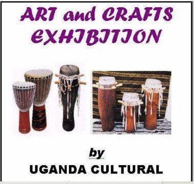
1. Choose "ART and CRAFTS EXHIBITION" as the title for your
poster.
2. Enter this text in a word processor.
3. Select it and change the font style to "Forte" and the
size to 48.
4. Centre align it and change the font colour to violet.
5. Enter the company name "Uganda Cultural Centre".
6. Select it and change the font style to "Arial Black" and
the size to 36.
Add other text to the poster, e.g slogans, captions.
It should be readable from a distance, but relatively smaller
in size in comparison to the title.
Vary the font styles.
7. Enter the "Dates of the Exhibition" and the
opening hours and any appropriate slogan.
Illustrations:
They should be simple but clear and easy to understand. There
should be minimal text to accompany the illustrations.
Some can be shown in a sequence that is easy to follow and
these should be organised into sections.
You could number your sections so the audience does not find
it hard to understand.
Remember: The poster should always speak for itself. Consider
all the elements and principles of design.
Avoid using many colours.
8. Search for appropriate illustrations, graphics from CDs,
the Internet, books, magazines and any other source of information

Layout of a poster:
This refers to the appearance and arrangement of collected
ideas onto the final format.
Tips (background):
You can use a coloured paper to improve the appearance of
your work or you can use plain white paper for your background.
You can also glue together different, but related coloured
papers.
Use a light background if the images are to be darker and
vise versa.
Assembling your poster:
After all the above activities, you are now ready to put together
all the different parts of your poster.
This can be done in two ways:
-Glue together the different pieces of work if they were done
on separate papers.
-Trace the different parts of your poster onto another piece
of paper.
Remember to be as creative as possible when rearranging your
work.
9. Assemble your graphics together with the text.
Notes to the Instructor/Art teacher
The learners should avoid using jargon, slangs or unusual
abbreviations.
Guide the learners in selecting the colours that will contrast
well, especially where the text will overlap the illustrations
or graphics.
Exercise:
You are making a first reading book for a senior one class.
Design the Double-page spread of the book and arrange it so
that there is room for words and four pictures.
It is important that both words and illustrations should only
deal with objects, plants, animals and people with which the
child is already familiar.
The size of a double page is 24cm by 30cm. One should use
creative lettering.
Related link:
https://www.kumc.edu/SAH/OTEd/jradel/Poster_Presentations/PstrStart.html
|
