WORD PROCESSING TUTORIAL
EXAMPLE: DESIGNING A LOGO
Introduction
A logo is an image which represents a company or its product.
Its function is to create a memorable, recognizable impression
on the mind of a potential client or customer.
Types of logos
There are three basic types of logos, which can be used alone
or combined within one design:
· illustrative logos (a logo which clearly illustrates
what your company does),
· graphic logos (a logo that includes a graphic, often
an abstraction, of what your company does), and
· font-based logos (a text treatment which represents
your company)
Qualities of a good logo
1. Simplicity:
2. Experimentation. One has to experiment with the fonts,
sizes and shapes.
3. Colour choice. Choose colours that have meaning in relation
to the client's needs.
4. Logo type. Determine whether it is illustrative, graphic
or font-based.
Objectives
Activity : Font based-logos
!. Open MS Word,
2. Enter any two letters of your choice in a new Document.
In this case, I have used M and W because they are the initials
of the author's names,
3. Select and change the font style of "M" to "Forte" and
size 90 and "W" to "Ravie" and size 72,
4. Change the font colour of "W" to red to create contrast
when later combined,

5. Copy and Paste the letters in MS. Paint. This is done
in order to combine them as images,
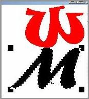
6. Combine the two letters creatively to create a logo,
7. Save the file as "Logo.bmp",
8. Open the file in MGI PhotoSuite,
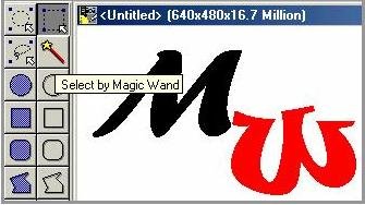
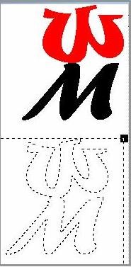
9. Using the Magic Wand tool, click on a letter to select
it. Drag it to the blank working space,

10. Combine as you wish to create a logo,

11. Using the Wang magic tool, click on the letters while
holding down the Shift key. Click on the background too and
drag,

12. Experiment with various combinations of the same letters.

Related link:
http://graphicdesign.about.com/library/weekly/aa102600a.htm
|
